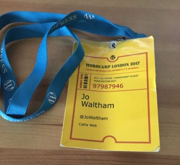
The annual WordCamp London is always a hot date in Callia Web’s diary, so Leeann and I headed down to the capital 17-19 March feeling excited about what was in store for them. Meeting up with old friends, making new friends, learning from the talks and generally feeling inspired – WordCamp London 2017 was another roaring success. Here are our highlights from the weekend.
 Jo
Jo
During WordCamp London, I took in a good mixture of talks covering technical topics as well as design and business.
Technical
The first talk I attended was “Showing ROI: How to Create a Content Marketing Report” by Ilia Markov and he reminded us of two key points when blogging for business:
- Blogging is a business strategy to help your business grow.
- Your main goal should not be to “generate traffic” but to generate revenue.
He also went on to give some great practical advice about using Google Analytics and Google Search Console to properly measure your KPIs (Key Performance Indicators). He mentioned an analytics tool I’ve not heard of before – Woopra – which is now firmly on my list of things to investigate.
Chris Wiegman’s talk on “Encrypt All The Things: Practical Encryption from SSL to Email and Beyond” gave me a lot of things to think about and I’ve a list of tools to look up, for example:
- ProtonMail for secure email
- Signal for secure instant messaging
- Cloak VPN for securing your internet browsing when using a public wifi
At the end of Day One, there was a panel discussing ways to build custom themes. Sue Fernandez was speaking about our favourite method – using the Genesis Framework.
On Day Two Tim Nash gave a talk on “Who’s Afraid of the Big Bad Host?” explaining the differences between shared hosting, containers, VPS (Virtual Private Server) and managed and unmanaged WordPress hosting – cutting through the jargon/marketing hype for us.
Design & Content
Whilst Leeann’s main focus was the design talks, I still went along to a couple. The first was “Designing for Accessibility” by Graham Armfield, and whilst he covered the basics I was already familiar with there is always more to learn. For example, that too much colour contrast makes a web page difficult for dyslexics to read – so no black on white, please.
Next up Alice Still, lead organiser of WordCamp Brighton taught a workshop on “Making Your Website More Inclusive Using Tone”. Now writing isn’t my thing, but this was educational in that I could appreciate just how much thought goes into every word on a page and a copywriter is invaluable for getting your point across well.
Business
I love how WordCamps are not only about the technology but also the business of running a web agency. I attended three talks on this:
- Tales from the Client Side: How to Create and Foster Loving Client Relationships – Tom Chute
- Ending Design Revision Hell – Nela Dunato
- How to Grow from Freelancer to Agency Owner – David Lockie
Some great takeaway points from these sessions:
- People ask how to grow an agency but you should be asking what your strategy, approach and vision will be and how it is all going to support you and your life – David Lockie
- Really know your client, do continuous discovery during the whole project – Tom Chute
- Don’t just find solutions, talk them through with the client – Tom Chute
- Be honest about pressure on resources and be clear on availability – Tom Chute
- Don’t just send visuals, present your work in context and explain your process – Nela Dunato
- Limit revisions to those things that have most impact otherwise you will have revisions just for revisions sake – Nela Dunato
Agile is a project management technique that I’ve heard of but whenever I’ve tried to dip my toe into it I’ve gotten confused by some of the terminology so I was delighted to go to Jim Bowes “Introduction to Agile”. Here I finally got to grips with the basics and identified that of the different techniques, Kanban is the one that would best serve our small agency whilst Scrum best serves larger agencies. So there’s no need to further understand the scrum process and focus my attention on Kanban.

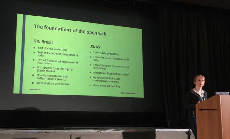
In these Bretix/Trump times, Heather Burns gave a thought-provoking address on “Defensive Web Development: Protecting the Web from Political Uncertainty” – if you work in web design and development do catch her talk on WordPress.tv
In addition
Over the three days, we also got to speak to a number of the event sponsors, including our preferred hosting partners – 34SP.com and WPEngine.com. And as well as meeting many of the other developers, designers and agency owners we talk with online.
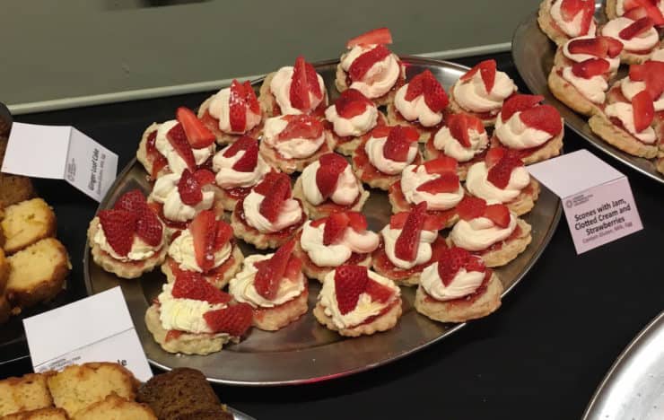
And WordCamp London was really spoiling us with all the delicious food… with these being Jo’s favourites 🙂

Leeann
I settled into the 2017 conference with the Lightening Sessions and three short talks by Marco Calicchia, Wendie Huis in ‘t Veld and Heather Dopson. These were a lovely and much-appreciated introduction to this years’ WordCamp London, drawing on some personal experiences (and a very moving story by Wendie), making the most of networking opportunities and how to fully appreciate that community spirit! The scene had been set, I was feeling the love and ready for the presentations ahead.
Content, Design & User Experience
The sessions I caught on Day One all seemed to be themed around the relationships between content, design and UX, the ones I attended included:
- “Object Oriented User Experience” by Crispin Read
- “Migrating Content is Like Moving House: How Did We End Up with all this Stuff? And where does it all go now?” by Edd Hurst
- “The Importance of Information Architecture: How to Organise Content to Improve User Experience” by Monique Dubbelman
- “Designing for Accessibility” by Graham Armfield
- “Website Design Pain Points for Clients and How to Help Them Through it” by Meg Fenn and Rachael Dines
Crispin shared in his presentation his strategies on how to connect ‘content’ to simplify and improve the user experience of a website. Edd’s presentation also focussed on content, using an analogy of ‘moving house’ is much like migrating content (which of course it is) and how we should be ‘letting go’ of old and useless content. During Monique’s presentation, we learned the importance of information architecture, structure, and getting the ‘labelling’ right.
Having looked at content and information architecture, we then discovered how and why making it accessible to everyone is so important (a subject close to my heart having a disabled child). Graham drew on his vast experience of web design showing us examples of websites that demonstrated good (and bad!) accessibility, and that there is no reason why an accessible website can’t look as fantastic as any other website with some consideration and good design practice.
Key points from these presentations:
- Simplify the design process
- Streamline content (ditch useless content!)
- Focus on clear communication and labelling
- The importance of accessibility in website design
Design & Marketing
Day Two’s presentations were more design and marketing orientated, the ones I attended included:
- “The Unbearable Likeness of Design” by Sarah Semark
- “The WordPress Cartoonist – A User’s Perspective” by Dave Walker
- “The Art of Empathy in Customer Marketing” by Nevena Tomovic.
Sarah’s presentation took us on a journey of web design from its infancy in the 90’s (think blinking, scrolling, multi-coloured, Netscape etc!) through to the slick and stylish websites of today. This presentation was a fun blast-from-the-past for anyone like me that started working on websites (back in the day) when there were no rule books or trends. Sarah’s key message, however, was that whilst website trends are a good template to follow, we should take inspiration from the print industry, nature, art and start pushing the boundaries a little.
Dave Walker’s presentation showcased his amazing talent of bringing websites to life with the use of cartoons and humour. He also shared with us his advice for choosing a theme, keeping it simple and minimal to let the content (or cartoons) shine, plus lots of tips from ensuring your website is kept updated, to choosing the right host.
Finally, I sat in on Nevena’s presentation, focusing again on content, and how to use empathy in your customer marketing. She showed us a couple of great examples of successful marketing campaigns, demonstrating that a personal approach helps to engage the customer and makes them feel valued.
Key messages from these presentations:
- Use simple, clean themes as a base template for a website (not hard when you already use the Genesis framework)
- Take inspiration and guidance from sources other than the internet
- Draw on humour where possible and illustrate (or get someone else to do it!)
- Personalise your content and speak to your audience
Final thoughts
Overall I thoroughly enjoyed WordCamp London 2017! The presentations were great, as was the incredibly friendly and inclusive atmosphere. It was fantastic meeting up with some familiar faces, meeting new people, eating cake and scones (what’s not to like there!) and drinking coffee by the bucket. Lovely!
I’ll have to make a note somewhere to check back on all of this in a few months to see that I really am following the tips and advice I’ve picked up this year, in the meantime roll-on WordCamp London 2018!
Thank you
Finally, a massive thank you to all the organisers, speakers, volunteers, MCs, sponsors and the venue staff – excellent job, well done.

 10 ways to detox your website in 2017
Hi Jo! It was great to meet you at WordCamp. Here’s to hoping we see you at WordCamp Miami next year.
Hi Chris. Good to meet you too. Yes, hopefully see you in Miami next year, logistics allowing.