Your primary school website has the potential to be your most powerful marketing tool. But knowing what to include on your website and how best to present all that information can be daunting.
How do you go about creating a website that showcases your school, attracts new students, connects with the parents of your current students and complies with Ofsted? To answer this question, I’ll take you through the approach we use at Callia Web when designing websites for primary schools.
How to design a successful primary school website
Your primary school website will need to target multiple audiences or ‘users’. In particular, it’ll need to address the needs of:
- Parents of prospective pupils
- Parents of current pupils
- Governing bodies
While some of their needs will overlap, each of these users have slightly different motivations.
Parents of prospective pupils will be trying to decide how your school compares to others. Meanwhile, parents of current pupils will primarily be looking for up-to-date information about what’s happening at your school.
On the other hand, governing bodies – such as Ofsted – will have a checklist of certain information they’ll make sure is readily available on your website.
To set yourself up for success, you’ll need to ensure your website is organised appropriately for all these audiences.
It’ll need to provide key, easily digestible information targeted to each type of user, while not alienating anyone.
Let’s dig into each of these user types to find out how we can design a website that works for everyone.
1. Designing for parents of prospective pupils
Your website is an ideal marketing tool for attracting more children to your school. In the case of primary school age children, it’s most likely to be their parents who make the ultimate decision on which school they attend.
To that end, it’s important to consider the types of information someone might want to know about your school before they choose to enrol their child.
You can think of this a bit like creating a brochure. It needs to show your school in its best light, with high-quality photos and clear messaging. It’s also important to let parents follow through on their enthusiasm for enrolling at your school by providing a way for them to easily get in touch!
We highly recommend you include the following on your website:
- Results: Parents will use these as an easy comparison between prospective schools.
- About your school: Include your ethos, vision and values, as well as information about your facilities and insight into what everyday life is like for pupils.
- Headteacher: Include a photo and a welcome message so parents can get to know them better.
- Feedback: Positive feedback from other parents helps build trust in your school.
- News: Provide regular, up-to-date news on activities and achievements to showcase your school.
- Extra-curricular info: Highlight any after-school clubs, sports and activities you offer.
- Admissions info: Specifically, make it clear how and when to enrol so they don’t miss the enrolment deadline.
- Contact details: Make it easy for parents to arrange a visit by providing a form and readily available contact details.
Bear in mind there are strict rules around the use of images and identifying children on your website.
If you don’t have permission to use images of your current pupils – don’t worry. Instead, you can get creative by using high-quality photos of your facilities, non-head shots, closeups of hands, backs of children and depth of field photography:

2. Designing for parents of current pupils
Once a child is enrolled, their parents will already be familiar with your school. At this point, convincing them via your website that your school is right for them, while still important, becomes much less so.
Instead, they’ll be more interested in quickly accessing any need-to-know information about your school.
Your website is an excellent central point parents can refer to when they want to check what’s happening – particularly as you can readily update information and link to any relevant external sites.
The key information parents of current pupils will look for includes:
- Term dates and key dates: Ideally format these dates as a calendar that parents can also print out and stick to their fridge!
- Uniform: Include clear guidelines as well as links to suppliers and second-hand uniforms.
- School dinners: You can display your menu on your site, plus provide a link to your ordering system.
- Staff: Include photos and names of staff, your staffing structure and who to contact if there’s an issue.
- Newsletters: You could publish these in a blog or link to an external email marketing platform, such as Mailchimp.
Parents will often be in a rush, and will want quick and easy access to information. This means user friendly and clear organisation is key.
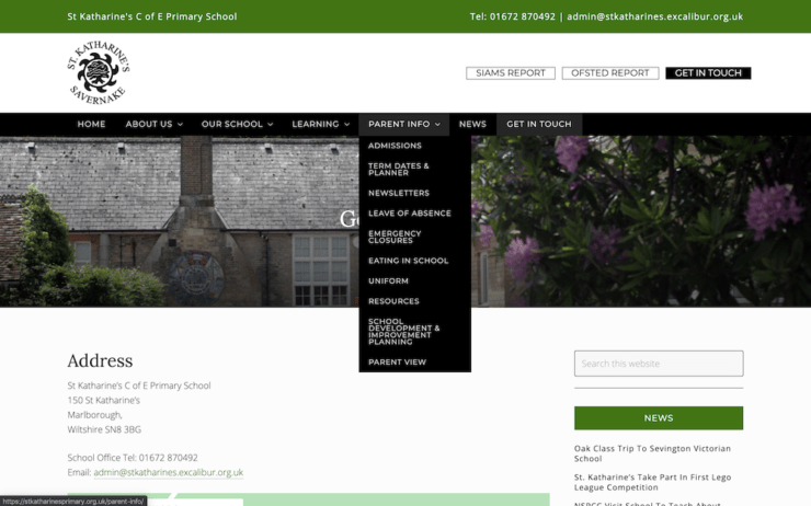
It’s therefore a good idea to make related need-to-know information accessible from one place.
Take for example a website we designed for St Katharine’s Primary School. A prominent menu item called, ‘Parent Info’, contains links to all the key information parents will want quick access to:

Separating it out from the more marketing-focused areas of your website also prevents new enrolments from getting bogged down.
3. Designing for governing bodies
There are clear rules around what information maintained schools must publish online. Because of this, your website is critical when your school is due an Ofsted inspection.
Every primary school must publish the following information, documents and policies on their website:
- Your school’s name and contact details
- Admission arrangements
- Results for Key Stage 2
- A link to the Government School Performance Tables Website
- Sport premium funding
- Information about your school’s Governors
- Ofsted report
- SEND policy
- Equality policy
- Safeguarding policy
Just like parents of prospective students, Ofsted will also want an insight into school life and to understand your school’s ethos, vision and values.
You can organise key documents and policies Ofsted will be looking for in a convenient menu accessible everywhere on your website – this could be in the header, footer and/or sidebar.
Publishing lots of documents and policies on your website can negatively impact its design. But you can organise it in a way that’s helpful for parents too. Let’s look at how…
When to make information most prominent
By considering your individual audiences’ needs, alongside which of their needs overlap, it becomes clearer how to design a website that will work for all its users.
For example: learning about your school is an Ofsted requirement, but it’s also especially relevant to parents of prospective students.
So let’s focus in on Ofsted reports, which have to be on your website by law but are also of great interest to parents.
Most parents will at some stage want to view your Ofsted report before they go on to enrol their child at your school. For many parents, it’ll be the very first thing they consider.
Proudly displaying your Ofsted report is convenient for users, but it also shows your school’s confidence in its outcome, reinforcing the positive traits of openness and transparency.
For all these reasons, prominently displaying your Ofsted report is often a good design choice.
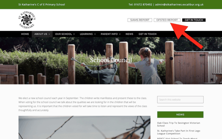
We opted for a prominent button in the top, right-hand corner of the St Katherine’s C of E Primary School website, where users can access their latest Ofsted report:

Another piece of key information this applies to is your phone number. Making this easy to find is a convenience – but it also shows your school is happy to openly communicate with parents.
Less prominent information
Some information, while still important to have available, will only be of interest to parents, if and when it becomes relevant to them.
This information includes:
- School policies on emergency closures and leave of absence
- Learning, curriculum and resources
- Special Educational Needs and Disability (SEND) policy and accessibility
- School clubs and extracurricular activities – parents of prospective pupils will be interested in what’s on offer, but parents of current pupils will be most interested in facts such as dates, times, prices and bookings
- Celebration of children in school news
- Links to social media platforms
This less routinely used information can take a less prominent presence in your website design than say your Ofsted report or contact details.
A primary school website design for all users
Your primary school website design does share some similarities with that of a business website. But you do have some added considerations: not least your Ofsted compliance.
Your website is the first place Ofsted will visit before they walk through your school doors for an inspection, and by law it must be kept updated with key information, policies and documents.
But this need not constrain you! As long as you address the needs of current and prospective parents too, you can ensure you website works for everyone.
With careful consideration, your website can meet all its regulatory requirements, keep parents informed and be a successful marketing tool.
If you need help with your primary school website design, we have extensive experience designing educational websites, and are always happy to answer your questions.

 What does my small business website need?
Your email message today about working from home instead of a need for offices, prompted me to have a look at your website and your blog posts.
This school website looks absolutely beautiful! – Just like the one you created for us.
Stay safe.
JDJ