Adding images straight to your WordPress blog is simple. And with a few extra tweaks, you can improve your site’s usability and keep your site running faster long term.
We’ve previously covered sourcing images for your blog posts. Here, we’ll cover easy ways to optimise them – including:
- Quickly resizing images
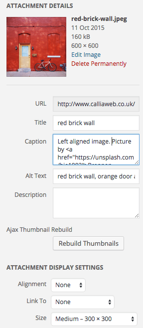
- Improving image accessibility with alt tags, captions and descriptions
- Making your image layouts attractive
Plus, we’ll touch on the Add Featured Image plugin by Robin Cornett. This plugin displays your featured images in a column on the Posts page of your WordPress admin panel – making it easy to see what images you’ve used where.
Why optimise images?
Correct image size, accessibility and layout are fundamental to the usability of your website.
Incorrectly sized images can make a website run slower. This irritates users but also has other knock-on effects. Site speed is an important ranking factor in Google’s algorithm. So a website with too-large images and a slow load speed will rank poorly compared to one with well-optimised images.
If images aren’t accessible – with accurate alt text and a caption – a whole subset of users could miss out on valuable content.
And bad image layouts can affect the design of a blog post and look unprofessional – reflecting poorly on a brand and putting off readers.
But don’t worry – optimising your images in WordPress is easy, and really quick too.
Resizing images for WordPress blog posts
The larger your image sizes, the longer they’ll take to load. And if your images take a long time to load, you’ll soon lose your readers’ interest. In the long term, uploading lots of large images to your site will really affect its performance.
For readers on mobile – with a smaller screen and slower internet connection in the mix – slow-loading images are a huge deterrent.
So each time you upload an image, be sure to resize it first – it only takes a few seconds and makes a huge difference.
There’s a trade off between image size and quality – but there’s usually no need for images to be any bigger than the width of your site, say 1200 pixels wide, and less if your site uses a sidebar.
There’s free and paid software you can use to optimise image sizes for your website.
Photoshop has a great Save for Web setting – with a handy feature that allows you to alter the image quality vs image size.
On my Mac I often use the Preview app (Tools > Adjust Size) to resize an image to a more web friendly size – don’t forget to do this to a copy of the image!
Then I use ImageOptim – this app automatically compresses images so they take up less space on your site and load quicker.
Finally I rename my image to something appropriate.
Once you’ve resized, optimised and renamed your image to a size and quality you’re happy with – you can upload it to your blog post.
To embed an image in your blog post, just select Add Media > Upload Files
And drop your image onto the window to upload.
After you’ve uploaded the image, you can choose from one of the pre-set sizes – perfect for keeping a consistent look across your site. Or you can choose a custom size.
To set your featured image (the one that shows on the blog posts page of your site), simply select Set featured image in the right-hand panel. Then upload your image as above or select one you’ve already uploaded.
Alt text, captions and descriptions

When you’ve uploaded your image – it’s time to take some important accessibility measures.
People with a visual impairment often use a screen reader to read web pages. Alternative text (alt-text) and captions are read out by screen readers.
Unless you add useful text to these fields, people using a screen reader will know nothing about the detail of your image and will miss out on the added context the image provides.
While it’s not always necessary to fill out all these fields, you should always fill out alternative text as a minimum. This is also the text that’ll show if an image can’t load, and it’s useful for getting an image indexed by Google.
It’s often a good idea to fill out the caption too – if they’ll help users understand an image more readily.
But don’t just put the same text in all fields. While the description isn’t visible to all users of your site, it’s incredibly annoying for people using a screen reader to listen to the same text being repeatedly read out.
Image layout
So you’ve resized and uploaded your images and correctly labelled them so they’re accessible. Now to play around with their layout.
WordPress makes it really easy to have attractive image layouts with just a couple of clicks. Simply click on the image you’ve inserted in your post then select from Align left, Align centre or Align right.

It’s worth checking how your image layout will look once you’ve published your blog. So click on the Preview Changes button to view your image in situ.
Have a look at how it sits in relation to other images in your post. You don’t want to cram all the images together, so play around with spacing.
It’s also a good idea to keep images near relevant body text, so readers don’t need to think too much about why an image was included.

You can also change the image placement setting, image sizing, and text settings within the Image Details screen. Simply select the image and click Edit to access all these settings on the same screen.
Images in WordPress link to their own image attachment page automatically. Unless your image needs to be viewed on a separate page – if it’s something like an infographic or template for example – it’s best to unlink now by clicking on the image and clicking Remove link in the toolbar.
And you’re done! Easy.
Display a featured image column
Your featured images are often assigned to your post on the archive pages. Some themes also use this image as a header or “statement” image that goes above or below your post title when viewing the individual post.
When you have lots of blog posts, each with a featured image, it can get a little tricky keeping track of when you’ve added images, and what images you’ve used.
The Add Featured Image plugin is (another) handy plugin by Robin Cornett. It solves this problem by adding a column to your Posts page in your WordPress Dashboard.
Like Robin’s Superside Me plugin, this one’s really nice and simple to use. An easy way to check which of your posts don’t have a featured image, improving the usability of your WordPress dashboard and streamlining the process of image optimisation.
Please share your image tips in the comments below.

 Customising comment date in Genesis 2.2
Leave a Reply