People don’t just visit websites on desktop – that’s why your website, should also be accessible on laptop, tablet and mobile as a minimum.
Responsive design is usually the way to go if you want your website to be accessible on all devices.
But the ability to access your website on mobile doesn’t just mean being able to view it.
It should also be user friendly. This requires a website that adapts seamlessly to a mobile screen, with a design that’s easy to navigate.
Of course, screen space on a mobile is at a premium. So web developers need to come up with clever ways to make the most of the space that’s available.
A new plugin I’ve tried out recently, SuperSide Me (affiliate link), really fits the bill and it’s my new favourite mobile responsive menu plugin.
Here I’m going to discuss first why responsive sites are so important, and then tell you why I love this great new plugin by Robin Cornett.
Why do I need a responsive website?
Last month, Ofcom declared the UK a ‘smartphone society’.
33% of people believe mobile is the most important device for accessing the internet. In contrast, 30% think their laptop is the most important, 19% prefer their tablet, and 14% their desktop computer.
While labelling the UK a ‘smartphone society’ is perhaps a little bold based on these figures – if nothing else, they highlight the variety of screen sizes people use to access the internet.
And it’s difficult, if not impossible, to predict which device any individual will pick at any one time to access your site.
So your best bet really is to have a responsive website – one that adjusts to a variety of screen sizes.
There are very few cases where having a completely separate website for mobile and desktop is a good idea. Majority of the time, one website that adjusts depending on screen size is the way to go.
A responsive website ensures a great user experience – whatever the device.
Mobile-friendly websites
A responsive website, should also mean a mobile-friendly website.
Google recognised the importance of mobile web browsing some time ago, and toward the end of 2014, they started actively encouraging people to make websites mobile friendly.
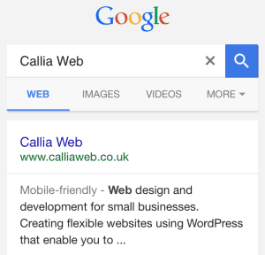
The first step was introducing ‘Mobile-friendly’ markers on mobile searches. Now, if someone comes across your website via a Google search, this marker tells them they’re likely to get a good experience should they click through.

I’m sure you’ve come across plenty of mobile unfriendly sites – the experience can be truly terrible.
Having to zoom in and out to read text that’s too small. Or scrolling around a page in order to view the whole width of it. These are hallmarks of a site that hasn’t been optimised for mobile.
This year, to further bring home the importance of a mobile-friendly website, Google introduced some important changes to their algorithms.
On mobile devices They now prioritise mobile-friendly sites over those that aren’t. These changes make it increasingly difficult for your website to be found if it’s not mobile-friendly.
If you’re reading this on anything other than mobile and want to check if your website’s mobile friendly, head over to Google’s Mobile-Friendly Test where you can type in your web address and get a verdict.
Mobile responsive menu
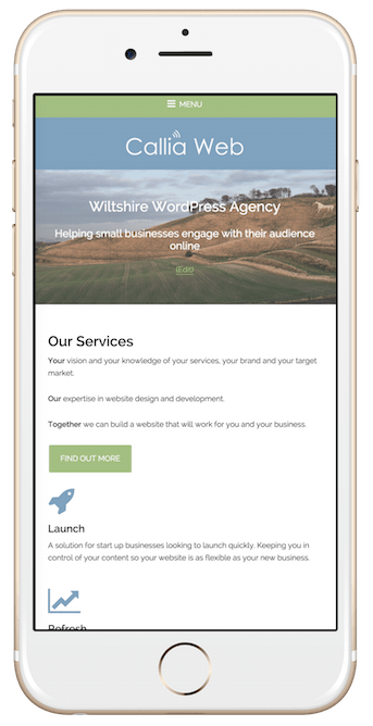
With far less space to fit an entire menu on mobile, the ‘hamburger button’ has become an increasingly common sight.
The icon consists of three horizontal lines – usually at the top right-hand side of your screen. Clicking on it reveals a menu.
In the interests of accessibility, the hamburger button should also be labelled with the word “Menu” to alert users to its presence. This is particularly important for people with a visual impairment who may be using a screen reader.
User-friendly, customisable and slick – we think Robin’s done a great job creating SuperSide Me.
This mobile-responsive plugin for WordPress is one of those plugins that just works – and it looks good too.
Even though there’s far less space on a mobile screen than on a laptop, this doesn’t mean the user experience is any less enjoyable.
SuperSide Me takes advantage of precious screen space by condensing menu items down. The easy-to-read menu items are then smoothly revealed with crisp animation when a user clicks on the menu icon.
Bespoke mobile menus are time-consuming to design and build, so this is a great alternative to build mobile-friendly functionality into your website.
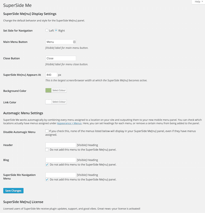
It comes with a very easy to use settings page so you’re not overwhelmed with choice and it just works out of the box!

Superside Me is a premium WordPress plugin – an annual licence for one website costs US$30pa.
We are using it on this website so take a look yourself. If you’re on a desktop computer then just shrink your browser window until it appears.
Take a look at SuperSide Me (affiliate link) for yourself, and if you’d like us to implement this plugin on your new website, we’d be delighted to.

 Why we use BlogVault to backup WordPress websites
Leave a Reply