Choosing the best images for your website isn’t just about sourcing ones that look good. We also need to think about how they’ll fit with your website design. This means thinking about your image size and aspect ratio.
In this post we’ll explore:
- What image size and aspect ratio are
- Why image size and aspect ratio are so important
- Suitability of your images for your website’s design
Aspect ratio and image size: the basics
Alongside sourcing your images, it’s important to assess how they’ll fit with your website design. To do this, we need to understand the impact of image size and aspect ratio on your site design.
Firstly, images always fall into one of two categories: portrait and landscape – this is known as orientation.
Portrait images will be taller than they are wide, landscape images will be wider than they are tall.
Once you’ve decided on the orientation of your image, it’s time to think about its size and shape.
Put simply:
Image size will determine how big or small the image is on a page.
Aspect ratio is the proportional relationship between its width and height – so will determine its shape.
What’s image size?
Let’s start with image size. This is simply the dimensions of your image.
You need to think about the space you have on your web page and how much of that you want to be taken up by an image.
The three images below show different dimensions of an image. When talking in terms of web design, images are always measured in pixels – the individual squares of colour that make up an image.
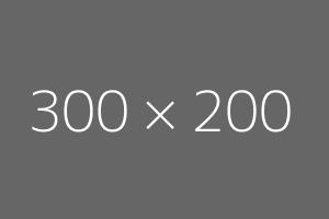
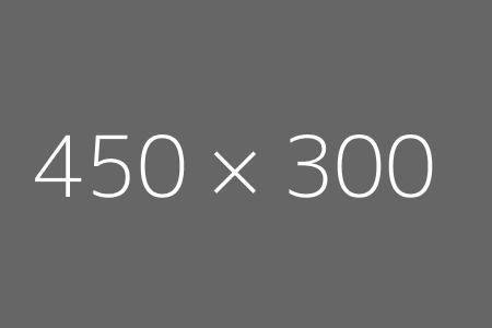
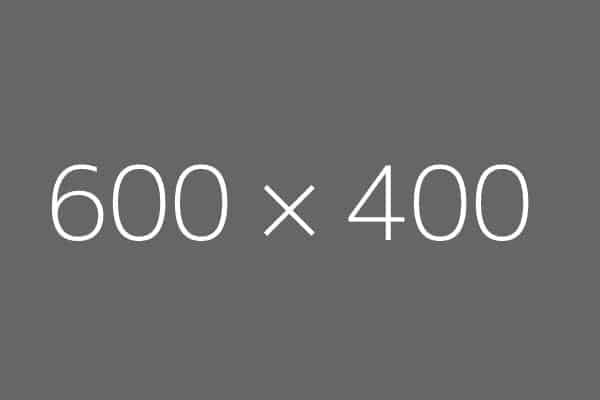
The above images are all exactly the same shape, just different dimensions. A logo probably wouldn’t need to take up half the width of your page, but the main photo for a blog post may do.
And while you can take a large-sized image and make it smaller – you can’t take a small size image and make it bigger. If you do, the individual pixels will become visible and the image will lose its quality or be pixelated.
So think about an image’s use before settling on its size.
What is aspect ratio?
While you consider the size of the photo – also think about its shape.
This is where aspect ratio comes in.
All three of those images above are the same aspect ratio, 3:2, meaning the height of the image is one third less than the width.
By changing the aspect ratio, you can change the image’s shape.
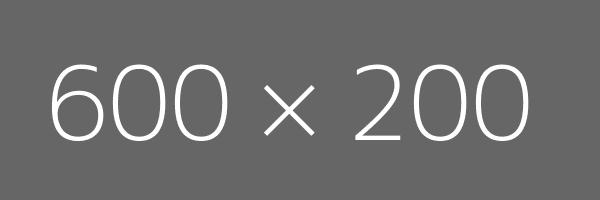
Here are some examples of an image with the same width, but a changing aspect ratio.
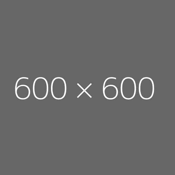
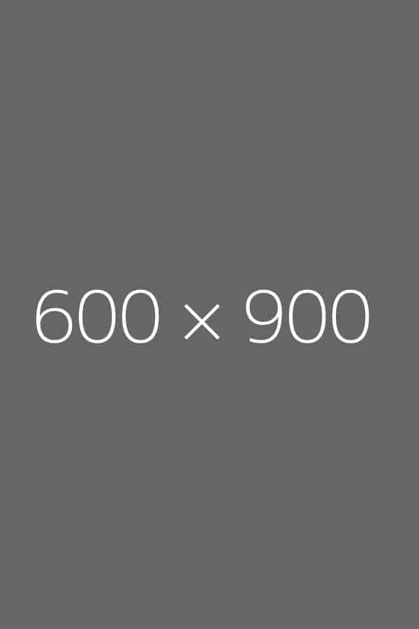
Why are aspect ratio and image size so important?
Aspect ratio and image size have a big impact on your site’s design. We can’t just throw any old images onto a website and expect them to look good.
To start, let’s look at using a full-width picture and consider:
1) When is it appropriate to use a full-width picture?
2) How do aspect ratio and size come into play?
It’s not often that an image needs to take up the whole width of a page – even if it’s a prominent one on a blog post or an ‘About’ page.
But you might use a full-width picture for your website’s header: to provide the overarching statement piece that pulls the site together.
You want this image wide, but not too tall – there isn’t much point in the header taking up the whole of the screen and the reader having to scroll down for ages before they can see anything else.
The below image gives an idea of the orientation (landscape), shape (short and wide), aspect ratio (4:1) for a good header picture. (I’ve had to use an 800 x 200px picture here so it fits within this blog post. For a full-width header it would be 1600 x 400px)

Image suitability
Having considered how size and aspect ratio will impact your web design – it’s time to make sure the image you want to use suitably shows off the subject.
It’s important to remember scaling images up will lose quality.
It’s extremely hard to increase a 200x200px picture to 400x400px and keep the quality. That’s because it will become pixelated. Here’s an example of an image of an apple at 100 x 100px that is then increased to 600 x 600px. You can see the bigger picture is fuzzy.

As a general rule of thumb, make a larger image smaller, not the other way around.
Secondly, not every image is going to be in the right shape for your requirements. Sometimes you’ll be able to change the aspect ratio to make the picture work for the size and shape you have chosen without compromising the subject – but sometimes that just won’t be possible.
Here’s an example of a suitable image choice:
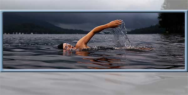
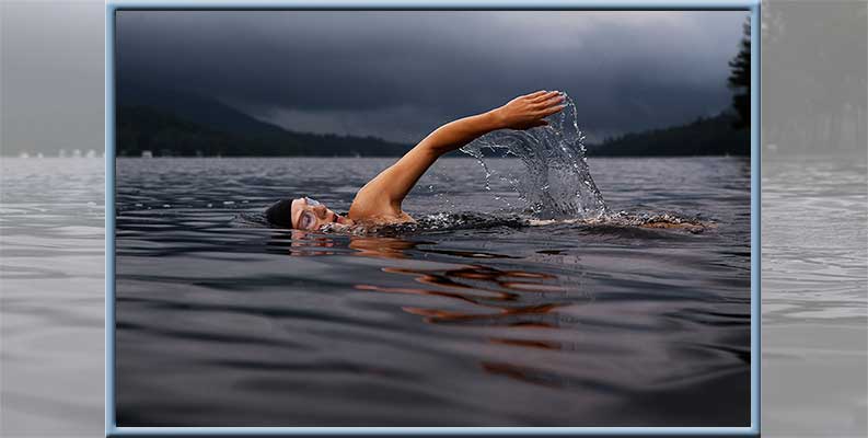
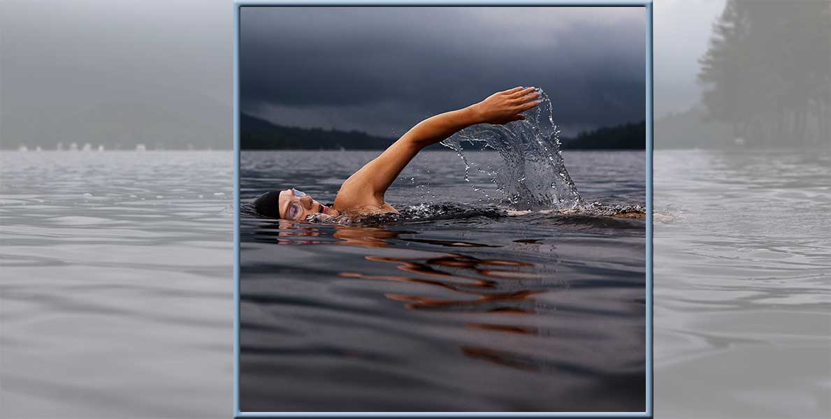
The aspect ratio for each of these images is different (3:1, 3:2, 1:1). Crucially though, the subject is fully included in all the pictures. It doesn’t matter what ratio the picture is at, the swimmer can still clearly be seen.
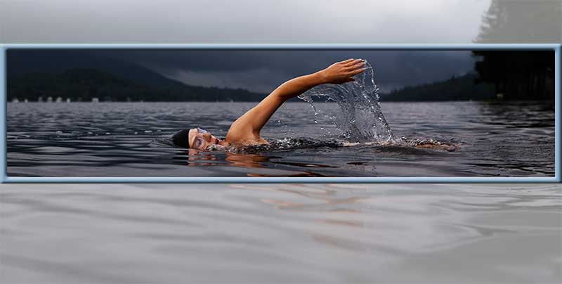
The image even works for the ‘wide but short’ shape that is ideal for a website header as seen below in the 4:1 frame:
And below is an example of an unsuitable image. Trying to fit this portrait image into a landscape shape is not going to work.
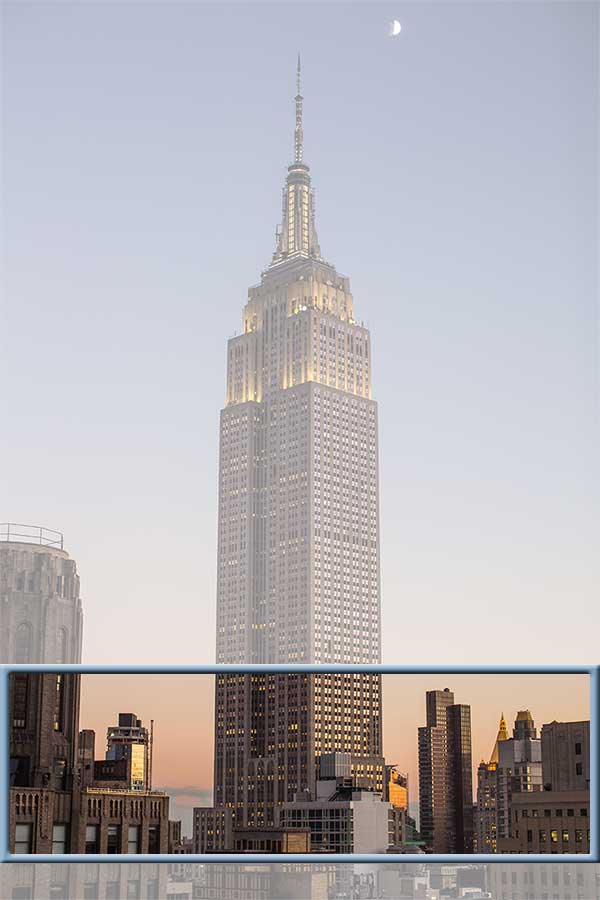
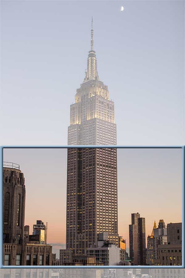
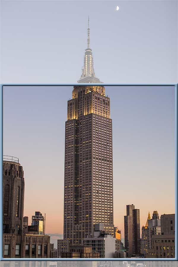
(Of course, if you needed a portrait image then it may be perfect.)
At this point, you have to weigh up whether the image in its original aspect ratio (think, shape) will work on your site.
Can you just adjust the size and still incorporate this image?
If the answer’s ‘no’, you’ll have to consider whether the shape or the subject is more important and what you’re willing to change.
Overall, balance is the key. Ensure your images are the right size for how eye-catching you want them to be – and how much of a statement you want them to make.
Think about how the shape works in relation to the rest of the content on your site.
And consider if the image you want to use can be successfully changed to fit to the size and aspect ratio you (or your web designer!) need.
Thank you to dummyimage.com for the ability to quickly generate the image sizes and to unsplash.com for the example images.
If you need help sourcing images for your website or any other website needs, then please get in touch with us.

 Optimise image size, accessibility and layout in WordPress
Thank you for this very complete but clear and useful post about the aspect ratio’s. The more Social Media sites I was trying to support on my website to share my posts and pages on, I noticed the differences and demands for all the different image sizes to be used on social media websites. I think after having implemented the 7 world wide mostly used social media I was already trying to remember 35 or more different sizes. With this explanation I was helped a lot in choosing the right ones for my site to or adding the “border” like extra space to the canvas that does not really contain the main view the image is intended to provide.
Starter for a new blog to follow around a little and also bookmarked now.
Keep up!
I’m a beginner online-designer and needed to understand the various sizes in pixels.
Thanx Loads! This site Helped Tremendously!