A website is an incredibly useful tool for charities, providing an easy-to-access platform for all your activities. From raising awareness, to collecting donations and recruiting volunteers – your charity website design can have a positive impact on virtually every area of your organisation.
To help you get the most out of your website, let’s investigate the important things to watch out for during the design process. Along with real-life examples, I’ll cover:
- Your website’s aim
- Content planning
- Calls to action
- Using best practice accessibility
- Choosing a hosting company
- Managing the design process
Let’s start from the top!
1. What is the aim of your charity website?
To design a website that truly meets the needs of your organisation, it’s vital to first know what your aims are. Some examples of aims for a charity website include:
- Collecting donations
- Getting sign-ups
- Promoting fundraisers
- Promoting events
- Recruiting volunteers
- Providing advice
- Communicating with supporters
- Taking bookings
- Signposting to other services or contacts
- Selling products
Often charities have not one, but multiple aims.
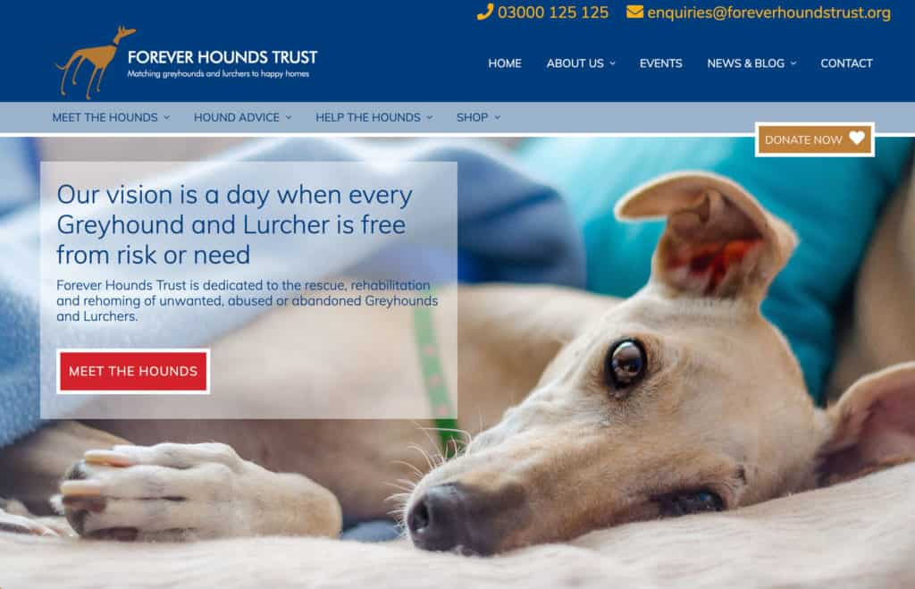
This is true for the website we designed for Forever Hounds Trust. Their aims include homing dogs, collecting donations, and selling fundraising products from the shop – all of which carry equal weight.
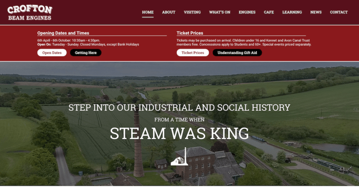
Meanwhile, Crofton Beam Engines primarily focus on using their website to drive visitors, with secondary emphasis on recruiting volunteers, educating and informing:

As well as deciding on the aim or aims of your website, setting goals that are Specific, Measurable, Attainable, Relevant and Time-bound (SMART goals) will ensure your charity website design is focused on success.
For example, one SMART goal could be to recruit 10 new volunteers in 6 months via your website.
Having a clear picture from the outset of what you’re trying to achieve will help immensely when you’re making any decisions about your charity website design. It will also minimise the risk of spending time and money on unnecessary features.
2. Content planning for a charity website design
From the most crucial regulatory information, to the content people will just expect to find when they arrive on your website, here’s a rundown of what you definitely won’t want to leave out:
- Key background information: This includes your organisation’s aim, strategy and vision statements. You can also include details about your trustees or founder and your charity’s history.
- How your charity helps: What do you do, how do you do it and who is it for?
- Contact details: While smaller charities may have contact details for one main office, larger charities should provide separate contacts for each division.
- Supporters: Any big supporters or partnerships should be clearly identifiable on your website.
- Your positive impact: You could showcase this in blog posts or through stories from people your organisation has helped. This content helps people understand how your organisation can help them. It also inspires others to take part in the work you do by donating or volunteering.
- Legal requirements: Your privacy policy and registered charity number are absolute must-haves. You’ll also need to keep a check on all your content to ensure it’s updated in line with any legal advice you receive.
- Gift Aid: If you intend to claim Gift Aid, make sure to inform your website’s users and prompt donors to make a declaration. Some donation platforms, like CAF Donate (see below) do this for you!
- High-quality images: Images are excellent for grabbing the attention of your website visitors. However, you’ll want to avoid low-quality, dated or too-small images. These can be off-putting and won’t reflect well on your organisation.
Your content interlinks closely with the layout and flow of your website. Rather than leaving it until the end, it’s best to begin work on it from the very start of the design process and iterate throughout.
3. Charity website calls to action
Most websites focus on pushing visitors toward a call to action: a prompt designed to persuade people to do something in particular. The one you’ll be very familiar with is a button labelled “Donate”!
Calls to action need to be prominent. This can be achieved with the appropriate use of colours, fonts and text. Calls to action also need to be placed where visitors are most likely to use them on your website.
Tying calls to action in with aims
While small businesses commonly focus on just one call to action, charities often have multiple calls to action. That’s because your calls to action will relate directly to the website aims from earlier.
If we go back to Forever Hounds Trust: their aims include getting donations, homing dogs and selling fundraising products from the shop. So, we’ve designed a prominent “Donate now” button, along with easy-access links to the shop and homing pages:

Note the “Donate now” button is available on every page of the website. This means, no matter what stage of the user journey, people can easily achieve this key aim.
Simplicity is important here: by removing clutter and providing obvious direction, your website’s users will find it easier and quicker to reach the correct destination.
When to use a microsite
In some cases, a separate microsite is the best option to encourage people to take action. If you’re organising a large campaign, a standalone site might best allow people to quickly access the most relevant information.
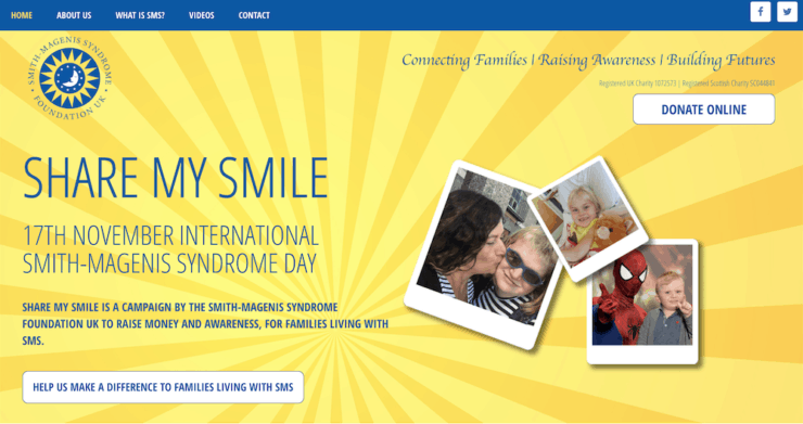
I run the charity, Smith-Magenis Syndrome Foundation UK and we’ve done exactly that for our main fundraising campaign, Share My Smile:

Using a microsite allows us to better engage our supporters in this particular campaign, to share campaign images, and to collect donations.
Where do your calls to action lead?
Let’s say someone clicks on the “Donate” button on your website. At this stage they’re highly committed to giving to your cause.
It’s worth then considering the payment gateway you’re going to use. You’ll want one that’s quick and easy to use, so as not to deter the donor. We recommend CAF Donate: a platform by the Charities Aid Foundation, ideal for taking donations online.
Indeed, wherever you want to lead your website users: clear, simple designs, layout and user journeys are your best chance at success.
Which brings us to the related area of accessibility.
4. Using best practice accessibility
All websites should pay attention to accessibility, but this is even truer when inclusivity is a key focus of your work.
Weaving accessibility into your website will limit the number of people excluded from accessing your information and taking part in your cause. Done right, accessibility touches every area of your website, from its code and images, to colour choices and the language and layout used.
The World Wide Web Consortium produces extensive guidelines against which you can measure exactly how accessible your website is, so it’s worth keeping track of these during your charity website design.
5. Choosing a hosting company
Hosting companies provide the infrastructure for storing and serving up your website to users. Every website needs to be hosted somewhere and there are a great many hosting companies to choose from.
For more information, you can check out Jo’s process for choosing a hosting company. Briefly, some of the key areas you’ll want to bear in mind when choosing your website hosting are:
- What features do you need? The features offered vary across hosts and across plans. Speed, a reasonable amount of disk space, an SSL certificate, excellent security, reliability, backups, and good support are some of the features you’re very likely to need. If you have a very high traffic website, you may need to look into a dedicated server.
- Where are the servers based? If your website visitors are mainly from the UK, it’s preferable (but not essential) to have UK-based hosting. This helps improve page loading times for the majority of your visitors.
- How much does it cost? Hosting plans range from a few pounds, up to many thousands of pounds at enterprise scale. The good news? There are some companies that provide free hosting for registered charities.
We often recommend 34SP.com to our clients. Their hosting is excellent and what’s more, it’s free for registered UK charities. As well, we’re very pleased that 34SP has committed to offsetting their carbon emissions by planting 7,500 square meters of new woodland every year. Web hosting can create surprisingly high carbon emissions, with data centres responsible for around the same volume of global greenhouse gas emissions as aviation.
6. Managing the design process
I’ve touched on some of the key areas of charity website design. But how do you go about coordinating them all?
This can be especially difficult when there are many stakeholders involved in the decision making. The more people involved, the greater the potential for differing opinions and the slower the process. This becomes exponentially more stressful when timescales are tight.
Some of my top tips to ease the stresses of your website design are:
- Phase the project in a step-by-step process. Begin with the essentials required in the short term, building on these over time.
- Designate one key contact within your charity. They can be responsible for communicating the website vision to your designers and making the final decisions.
- Limit the options. Let your designer do the heavy lifting of whittling down to a few design options that meet the needs of your charity.
At Callia Web we have lots of experience designing websites for charities like yours – we’d love to discuss what we can do for you and how we can make the design process as stress free as possible! Do get in touch with any questions.

 Celebrating success
Leave a Reply