There are a mind-blowing amount of food blog designs out there, so if you’re looking for some inspiration for a site redesign, it’s always worth looking at what the competition are up to.
It’s crucial to identify exactly what it is you love about someone’s website; not just the look and feel, but the functionality and layout too. I have scoured the web to cherry-pick my top five food blogs from a design perspective. I stepped outside of the Callia Web client base and looked further afield to see what’s going on.
I’ve shortlisted five websites based on their design and organisation of content, and interestingly they are all very different! I’m no expert in the actual content or writing, but like with any hungry reader, a recipe with good ingredients and pictures will naturally draw me in…
1. Eating with your hands
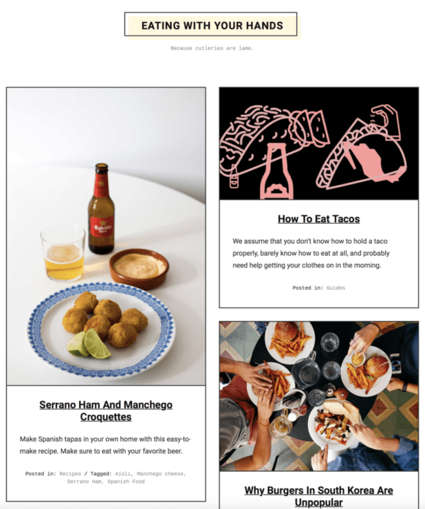
This is probably like design marmite, but I love, love, love the minimal black/white/cream simplicity. There’s lots of white space and it’s not overloaded with menus or unnecessary clutter. Only five latest posts are shown in the main content area. It has a trendy street food/Wagamama and masculine feel to it, which sets it apart from many of the very feminine foody blogs out there. I love the two sticky menus vertically aligned at the two side edges. And above all I really love the simplicity of the post pages.
Have a look around: eatingwithyourhands.com
2. Pinch of Yum
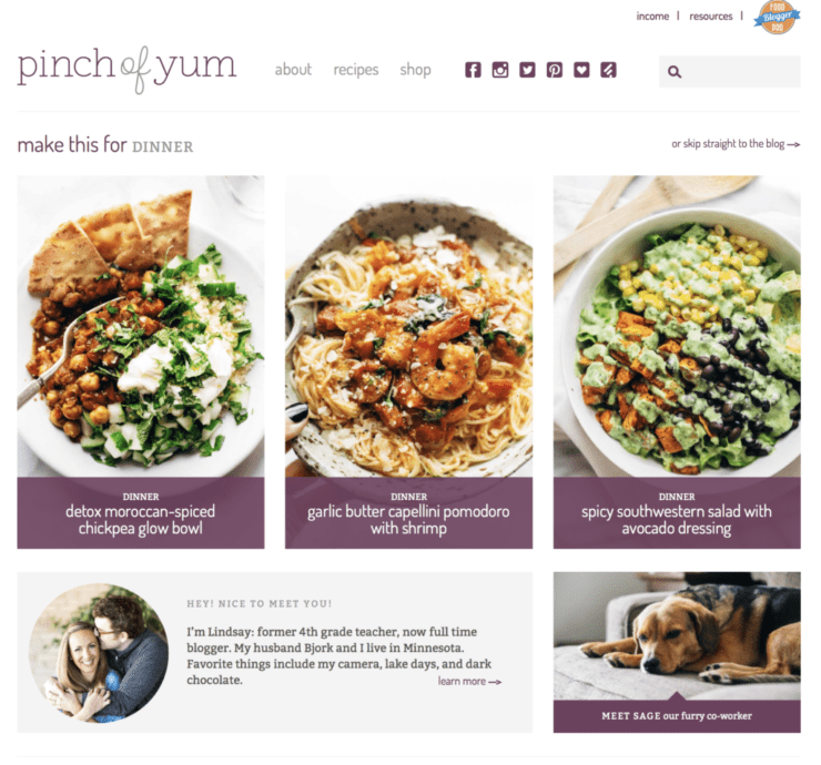
The content on the homepage is well organised, with a clean and simple colour palette of plum and grey which complements the colours of the recipe images. The strong pairing of typefaces and colours gives it a clean and contemporary feel. I like the list of top posts on the right side. Everything is very well considered and thought out with a great eye for detail. I like the layout of the recipes archive page, with the filters on the right side. Love all the extra details on the recipe pages, beautifully played out.
Have a look around: pinchofyum.com
3. Deliciously Ella
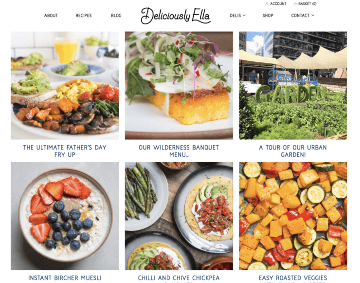
This food blog has been revamped recently. She has kept her vintage logo and typefaces, and the pastels in her colour palette sky blue, mint green and cream which all complement each other perfectly. I like the layout of the six large posts at the top of the homepage – categorised either by news or recipe. These are clean, big and bold. This website sells the ‘Deliciously Ella’ brand extremely well, everything on the homepage, header and footer has a place.
Have a look around: deliciouslyella.com
4. Livia’s Kitchen
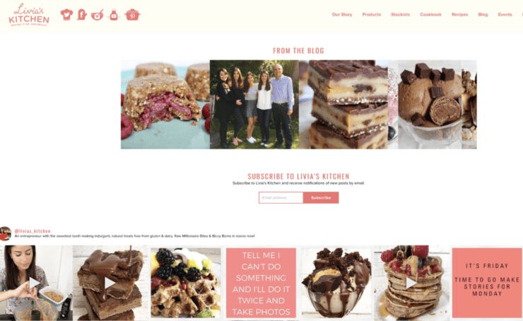
Another food blog with a strong brand identity, largely due to the range of products she has developed for sale. The Salmon pink, ivory and white colour palette works well together. The products stand out on a cleanly designed framework, again using a complementary colour palette which make them look very appealing. Her menus and organisation make it clear where to find content and the purpose of the website.
Have a look around: liviaskitchen.co.uk
5. Call Me Cupcake
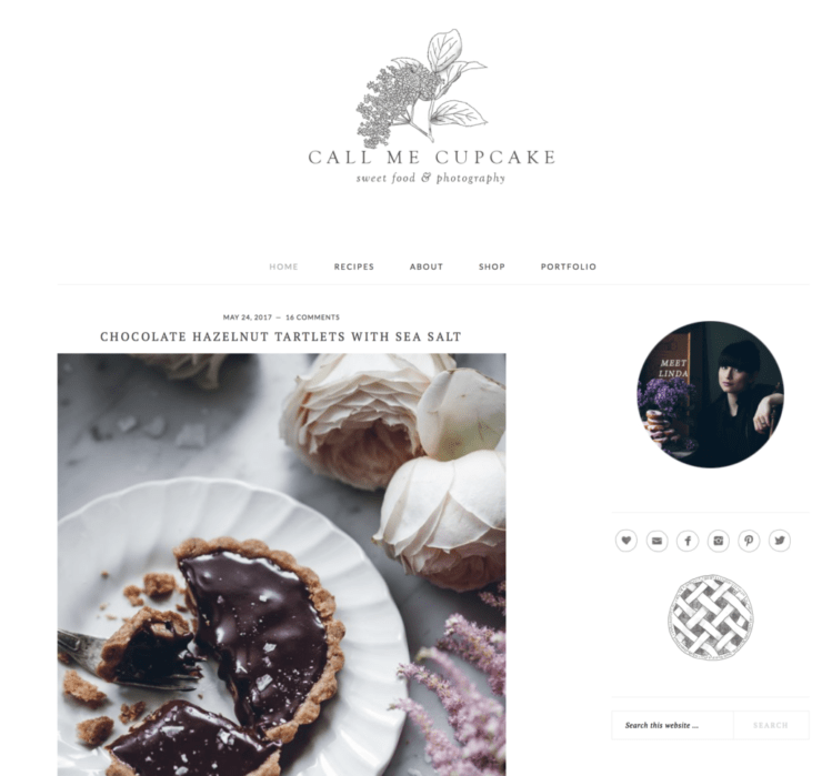
Using the Brunch theme, this is a beautifully designed website, with pure indulgence at its core. The photography is exquisite and alluring, and simply invites you to view the recipes. Despite the sheer indulgence of the photography, she has been quite restrained about using the grid widgets to allow the recipes some space to sing. The use of white space is akin to a high end glossy magazine. I like the simplicity of the blog archive page in a simple grid format.
Have a look around: callmecupcake.se
Have your say!
Do you agree with Leeann’s choices? What are your favourite foodie websites? Tell us what they are and why you love them in the comments below.

 Making your website images equal sizes: the difference between hard and soft crop
Thanks for the Pinch of Yum shout-out, Katie. Really appreciate it!
You’re welcome Bjork!