Most people will have multiple images on their websites. How you choose to display images will vary depending on what their purpose is and how they look with your website design. A hard crop is useful if you’re looking to make your website images equal sizes, whereas a soft crop is useful if you don’t want to chop off parts of an image.
In this post, we’ll cover:
- What the different WordPress image cropping methods are
- The effects of soft cropping and hard cropping on your images and site design
- When you might choose to use a hard crop vs a soft crop
- How to select a predefined image size on your website
- How to define new image sizes
Landscape, square and portrait images
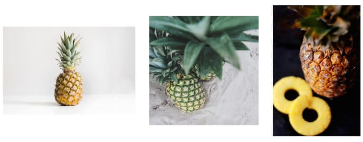
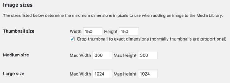
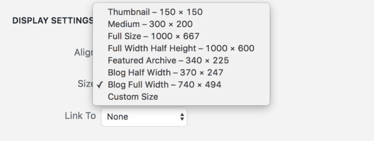
For this post we’ll be using the three pineapple images below for our size and cropping examples:

We’ve previously talked about the importance of image size and aspect ratio in web design. To refresh: image size will determine how big or small an image is on a page. And aspect ratio is the proportional relationship between its width and height – so determines an image’s shape.
This means our pineapple images all have different aspect ratios. The first image is landscape (wider than it is tall), the second image is square (same width and height), and the last is portrait (taller than it is wide).
Cropping images
When uploading images to your site, you’ll need to think about the purpose of those images. Is it important to keep the entire image? Or is it best to crop a bit off to make your images equal sizes and better fit your site’s design?
If we’re uploading all three of these images to our website, how can we go about making them equal sizes? Or would we even want to? This is when hard and soft cropping comes into play.
WordPress websites allow two types of image cropping – soft crop and hard crop. Let’s look at what each of these means and when we might want to use them.
What is a soft crop?
If you’re using a soft crop, you won’t chop off any of your image when it’s uploaded to your site. Instead, a soft crop reduces an image’s size proportionally, keeping its original aspect ratio (and therefore shape).
In the example below, we’ve uploaded the original pineapple images using a soft crop of 300px height and 300px width:

After uploading to our website, none of the images will be any taller or wider than 300px.
The landscape image has a width of 300px but a height of only 200px. The square has a width of 300px and height of 300px. The portrait has a height of 300px and width of 200px.
They are reduced in size but maintain their original aspect ratios. That’s why they’re all still different shapes from each other.
A soft crop is best when you don’t want any part of your images chopped off. One example might be displaying photographs on a photography site. Here, uniformity in shape is less important than preserving the entirety of an image.
Making images equal sizes with a hard crop
A hard crop will chop off any part of your image outside of the specified width and height when it’s uploaded to your site. In this case, images are cropped to a uniform height and width.
In the example below, we’ve uploaded the original pineapple images using a hard crop of 300px height and 300px width:

After uploading to our website, all the images above become 300px wide and 300px tall.
They’re reduced in size, but only the square image will keep its original aspect ratio. The landscape and portrait images get cropped to fit their new aspect ratio.
So the landscape image is cropped on the left and right, and the portrait image is cropped top and bottom.
A hard crop is best when you don’t mind your images being chopped off or if all your images have the same aspect ratio.
One example might be displaying a group of images on your home page, where image size uniformity is an integral part of the website design.
Other examples where equal image sizes might be important include a blog post archive page or eCommerce product images.
In the above hard crop example, we’ve chosen to go with the same width and height, thereby creating square images. Instead, we could specify a different width and height if we wanted to upload portrait or landscape images.
For example, a width of 300px, height of 200px and hard crop would give us three landscape images. Our landscape image would remain uncropped, but the square and portrait images would have a bit chopped off the top and bottom.
WordPress image sizes: the default settings
WordPress by default gives you just three image sizes: thumbnail, medium and large. You can edit these sizes in the Dashboard if you go to Settings > Media:

Here, you’ll also notice the option, Crop thumbnail to exact dimension (normally thumbnails are proportional). If this box is ticked, thumbnail image size is hard cropped. When unticked, they will be soft cropped. The medium and large sizes are usually soft cropped.
Theme and plugin developers will often add additional images sizes and define them as soft or hard crop in their theme and plugin code.
Display settings
You can choose which size to use in the Display Settings window each time you upload an image.
Say we want to upload a 1000px by 667px photo to a new blog post. When we upload photos to the blog and select our ‘Blog Full Width’ size in Display Settings, the largest this image can be is 740px by 494px.

As we’ve set this up to be a soft crop and our uploaded photo is a slightly different aspect ratio, the actual maximum image size will be 740px by 494px.
If we were uploading a much taller image, we may choose to use a different predefined soft crop image size, a ‘Custom Size’, or a hard crop – it really depends what looks and works best for the image purpose.
Note that by uploading a photo a bit larger than the maximum size, we know it won’t lose quality or pixelate. And, as our site is responsive, the maximum size will reduce proportionally on smaller screens, including on mobile.
Setting up new image sizes
You can modify your predefined image sizes by changing the max-width and/or max height in the Image Sizes screen. But what if you want more than three sizes to choose from when uploading?
As you can see in our Display Settings above, we have seven custom sizes on the Callia Web site.
An elegant solution is to code bespoke image sizes into your theme. If you aren’t comfortable doing this yourself, or if you need any help with your website design, don’t hesitate to get in touch!

 Review: latest recipe plugins for WordPress
Hello Jo. Thanks for the helpful article. Wat about making all images for a home page gallery (used instead of a static banner) the same size, keeping aspect/ratio? soft-cropping not to loose any part of the picture… i have a responsive free (not premium) theme and a gallery add on… but I cannot figure out how to crop images for that particular gallery, since it seems to override the values set on WP. I’d like to crop the images before uploading them. is there any softare or website that can hep me do just that, keeping proportions and quality? thanks!
Hi Elle. I use a Mac and I simply use the inbuilt in preview app to crop images. Alternatively you can use Photoshop.
Hi, I was just reading your article and found it helpful, however, my images on my e-commerce WordPress site were all the same size and now suddenly they are not. When I go to the customizer (because that’s where the display options are now) the sizes all look the same, but on the actual website they don’t. Is there any way to fix this? I don’t know how they re-sized on their own.
Hi Jennifer, we’ve experienced this too, after a recent WooCommerce update. What we did to resolve it was to slightly adjust the image sizes in the customiser so we could force a save, then regenerated thumbnails, and finally clearing all cache.