When you’re building a brand new website, it can be easy to get excited about all the extra features you’ll include. So a minimum viable website (like a minimum viable product) may seem counter-intuitive.
Surely it’s better to include everything before launch?
But taking a minimalist approach doesn’t mean your website looks unfinished or amateur. Quite the opposite.
Starting with an uncluttered website helps you satisfy your customers’ needs.
Whether you’re rebranding or launching your business for the first time, it means you can spend your budget in targeted areas.
A minimum viable website lets you create a successful website now, which will become even more successful in future. Much better this, than spending lots of time and all your budget on an expensive flop.
What is a minimum viable product?
Instead of guessing everything single thing a customer might be looking for at some point down the line, an MVP (minimum viable product) starts with the essentials.
The idea is to include only what’s needed to launch a product and then assess how successful it is before expanding your offering.
The lean startup methodology is the process for releasing new products efficiently. It’s not about “failing fast and failing cheap.” It’s about product improvement based on measurement.
This is how it works:
- Build a product
- Measure if the product’s working
- Learn from those measurements
- Expand or change the product
- Repeat
The key is to test a product in real life with your customers at the earliest possible stage. This lean MVP approach means you can get the right products in front of customers faster and with less input.
And it minimises the risk of spending your budget on too many features nobody wants.
So why create a minimum viable website?
A minimum viable website follows the same principle as an MVP: design and build for the minimum workable requirements of your customers.
Until you test a website on the people really using it, it’s not possible to know what else they need. Or indeed what they don’t need.
Just like an MVP, the minimum viable website is about building in the essentials, then expanding on those based on what actually works.
For example, at first it may seem like a good idea to include all the content you can possibly think of before launch.
But what if you then discover your customers aren’t interested in the vast majority of your content? You’ll have already used up too much time and money on design, development and content production.
If instead you provide some of the content you believe people will be interested in, you can later focus in on what people actually engage with and expand those areas if needed.
How do I know what’s working for my customers?
There are many different ways to assess the success of your website. Google Analytics and Hotjar are two useful tools to help you understand how people are using your website after launch.
Google Analytics
Google Analytics has a whole host of useful features. Users Flow is one feature that gives you a quick overview of how people move through your website.
Are they going to the right pages? Do certain pages seem to cause an obvious drop-off in visitors? Is your website accessible enough? If you find people aren’t doing what you expect, you can look at improving the problem pages.
Users Flow also helps you identify the most successful areas of your site. For example, the pages where you’re getting a lot of engagement. By learning from the areas that are working particularly well, you can invest more time in improving other areas and move away from what isn’t working.
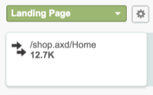
Users Flow shows you how many people arrive on your landing page. In the example below, is an eCommerce home page:

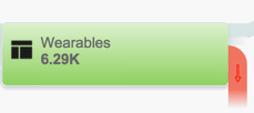
A number of people may then drop off your site when they reach a product page:

At this stage, you’d want to assess whether this number of drop-offs is too high. Are there ways to improve engagement and reduce the drop-offs?
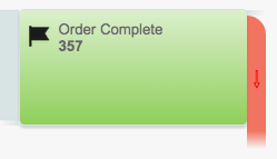
You might then take a look at how many people are actually buying from your website:

You can learn from the number of complete orders. What was successful? What can be improved?
By measuring changes in Users Flow and reacting to them, you can continuously improve sales.
Hotjar
Hotjar is a tool that anonymously records how real people use different pages on your website.
With Hotjar’s basic plan, you can record 1000 page views in real-time. The software then generates heatmaps out of these page views. The heatmaps are a grouped view of:
- How often people click on different areas, links and buttons on your site
- Where people place the mouse and for how long
- How far they scroll down your page by percentage
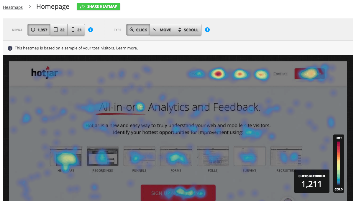
This image shows an accumulated view of where people click on a website page:

This data gives useful insight into how users interact with each of your website pages. You can see if they’re doing what you expect them to do. And you can look for areas in need of improvement.
For example: if no one is clicking on your call to actions, you could try out some different text or a new button colour. Or if lots of people click on certain links, you can apply these successful aspects to other areas of your website.
Equally, if nobody is reaching the bottom of your page or they aren’t moving around the page as you’d like, you could consider rearranging the page so it’s more engaging.
A website is for life
A WordPress website is never set in stone. It’s for life. You can always add on extra features later, or strip away features that aren’t working.
Everything can be modified, including text, images, colours and SEO. So you don’t need to worry about taking a lighter approach to features from launch.
Think of your website as fluid. It should change in response to your customers’ needs and expectations.
Don’t feel like website launch is your one shot to include everything. They’re wonderfully adaptable.

 Exclude tag from the WordPress tag cloud widget
Leave a Reply